

Mobile navigation that helps people find your healthcare services

A small screen can expose a large website problem. Patients see unclear labels, crowded menus, and hard-to-find location pages. Marketing teams see the same gaps across search landing pages. Healthcare website mobile navigation design should help people find relevant information without guessing.
For agency buyers, this work deserves more than a fresh menu style. It needs clear links, sound page structure, and useful content. Those choices support SEO, answer engine optimization (AEO), and AI search work. They also make the site easier to use after someone arrives.
This guide explains what to review and what to request. It applies to addiction treatment, mental health, dental, med spa, and other healthcare sites.
What Should Healthcare Mobile Navigation Design Achieve?
A healthcare mobile menu should give visitors clear paths to services, locations, and contact details. It should match the pages your search strategy needs. That makes navigation part of healthcare SEO planning and answer engine optimization, rather than a separate design task with no content plan.
Start with the questions visitors bring to your website. What services does this practice offer? Where is the nearest office? How can someone ask about scheduling or access? The menu should make these paths easy to spot.
Each label should describe the page behind it. A label such as Services is useful for a broad group. Within that group, use the actual names of your services. Avoid clever names that require visitors to decode your brand language.
The mobile menu does not need every page on the site. It needs a clear route to the pages that matter. Place deeper resources within useful section pages. Keep those pages linked so visitors can continue without starting over.
For addiction treatment sites, distinguish rehab, detox, IOP, PHP, and residential programs where offered. Spell out intensive outpatient program and partial hospitalization program on their pages. Explain the terms without making clinical or treatment-outcome claims.
For mental health practices, organize real services with clear names. Dental practices can separate service pages from office location pages. Med spa sites should use accurate service labels without adding unsupported claims.
Search visitors may enter through a service page, not the homepage. Give them the same clear menu and contact route. A page should still make sense when reached on its own.
Review the menu as a site-wide system, not a homepage feature. Include the header, footer, section links, and contact controls. Together, they help people understand where they are and what to do next.
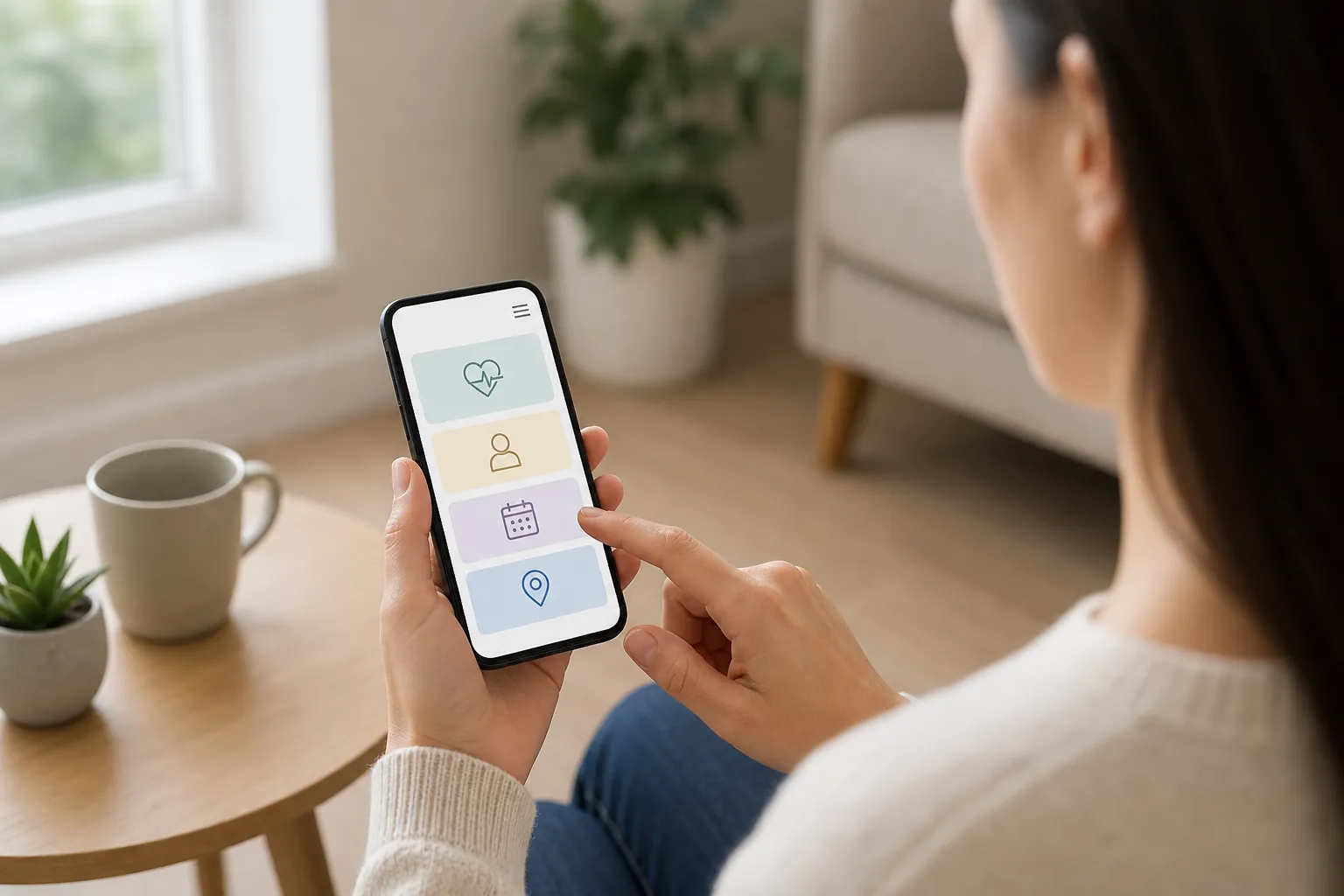
How Do You Choose Clear Menu Labels And Paths?
Choose labels that describe real services and match the destination page. Group related pages under a short, useful heading. A healthcare SEO strategy should guide that structure, while AEO content planning helps connect common visitor questions with pages that answer them in plain language.
Build a page map before changing the menu. List current pages, their purpose, and their intended audience. Mark outdated pages and overlapping content for review. Do not remove useful pages simply to make the menu shorter.
A page map can reveal gaps between navigation and content. For example, a service may appear in the menu without a useful page. Another service may have a strong page but no clear route. Both gaps deserve attention before launch.
- Use familiar service names that visitors can understand without reading brand copy.
- Give each menu item a destination that matches its label and purpose.
- Separate services from locations when both groups contain several useful pages.
- Keep contact options easy to find from every main service page.
- Remove duplicate labels when they send visitors to the same destination.
Decide which pages belong in the main menu. Services, locations, about, and contact often form a useful base. The exact order should reflect your site and visitor needs. There is no single menu that suits every healthcare business.
Use deeper section pages for larger service groups. These pages should summarize each option and link to details. That gives visitors context before they choose another page. It also creates useful internal links beyond the menu.
Be careful with location labels. A city page should reflect a real office or a clearly described service area. Do not imply a physical office where none exists. Keep addresses and location details aligned across the site.
Ask the agency to explain each proposed label and grouping. The answer should connect visitor needs with actual page content. A shorter menu is useful when it preserves those connections. Brevity alone is not a sound navigation plan.
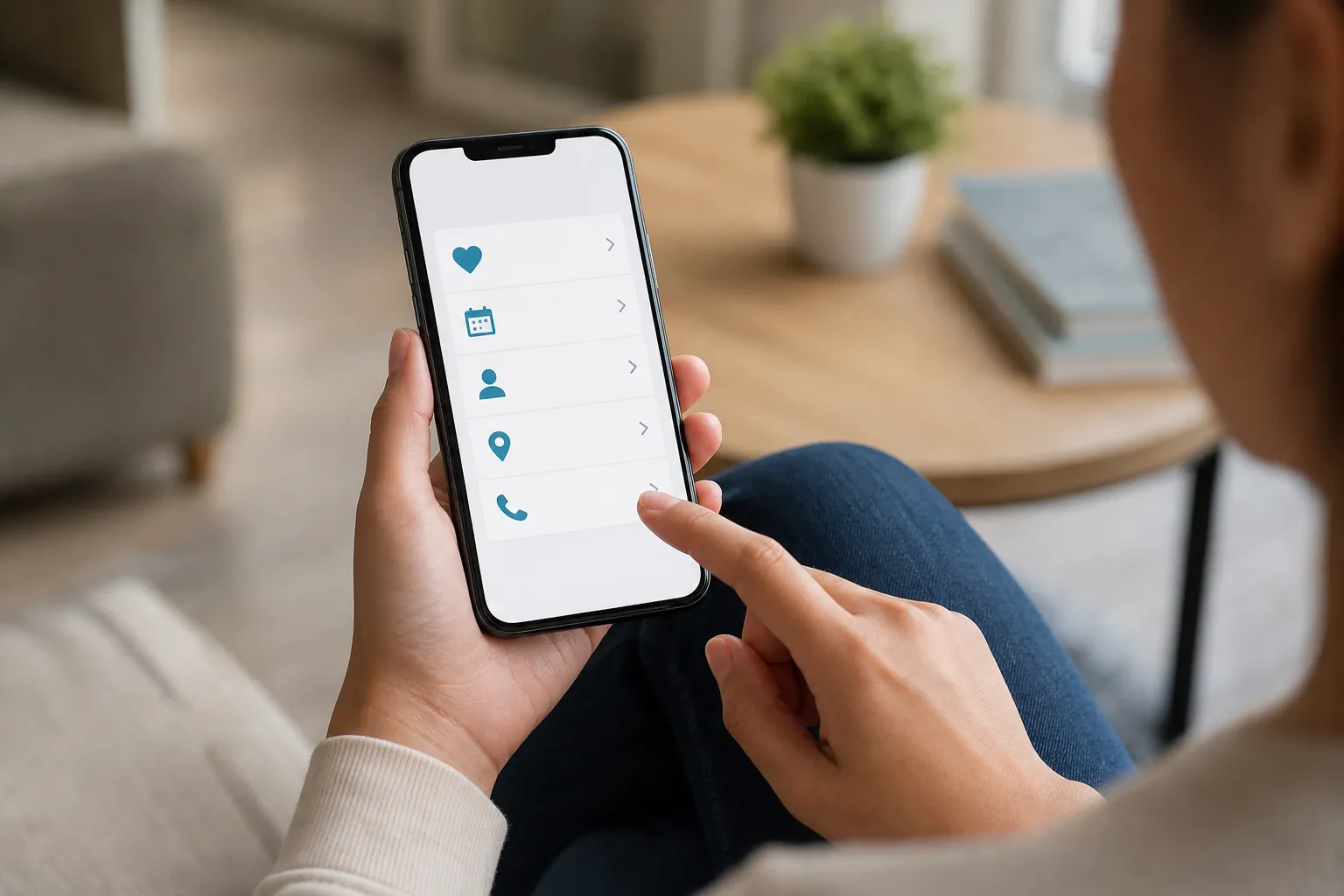
How Should Mobile Menus Work For People And Search?
Mobile menus should open, close, and link to pages without confusion. Important links should remain usable across screen sizes and input methods. Include these checks within healthcare website SEO work and LLM SEO planning, while keeping technical fixes separate from claims about search placement.
Test the menu on real phones when possible. A desktop preview can miss awkward touch controls or screen overlap. Check both portrait and landscape views. Try pages with longer titles and larger text settings.
People should know which control opens the menu. A clear Menu label can help explain an icon. Once open, the panel should show readable links. The close control should stay visible and easy to use.
Do not make essential links depend on hover behavior. Touch screens need a clear way to reveal nested pages. Separate the link to a section page from its expand control. Otherwise, visitors may not know what a tap will do.
Keyboard use also needs review. Visitors should be able to reach links and controls in a sensible order. Focus should stay visible as they move through the menu. Opening and closing the panel should not leave them lost.
For search access, request a technical review of navigation links. Important destinations should use working links with actual page addresses. The agency should check rendered pages and crawl findings. A menu that looks right can still contain broken links.
Google's AI features guidance includes internal links that make content findable and a useful page experience among ordinary SEO practices. It states that AI Overviews and AI Mode need no extra optimization requirements; these recommendations do not establish a promised citation.
- Check that every menu link reaches the intended live page.
- Test nested menus with touch controls and keyboard navigation before launch.
- Confirm that larger text does not hide labels or close controls.
- Review sticky headers so they do not cover important page content.
- Check that menu scripts work across key page templates and devices.
- Keep essential navigation available without relying on a search box.
Technical fixes should support a clear content structure. They do not create visibility by themselves. Ask for documented tests, identified issues, and proposed fixes. That evidence is more useful than broad claims about a search-ready menu.
How Can Navigation Support AEO And AI Search?
Navigation supports answer-focused content by linking clear questions to useful pages. It helps visitors move from a brief answer to fuller details. Combine answer engine optimization services with AI search and LLM SEO to review page structure, internal links, and content clarity as one connected task.
Google AI Overviews, ChatGPT, Perplexity, and Gemini belong in the planning discussion. However, a menu change does not ensure a mention or citation. Treat navigation as part of making useful pages easier to reach. Keep platform visibility claims separate from the work delivered.
The destination page matters as much as the menu label. A service page should state what the practice offers. A location page should identify the office and contact details. An access page should explain the relevant next steps without vague language.
Place a short, direct answer near the start of important pages. Follow it with details that support the answer. Use headings that reflect real questions when that format fits. Avoid adding question headings purely to repeat search phrases.
Internal links should describe the information a visitor will find. For example, View our office locations signals a clear destination. Click here gives less context when read on its own. Keep link wording consistent with the page title and content.
Do not move all useful answers into the menu. Menus guide people; pages explain services and business details. A crowded panel is a poor place for long descriptions. Use section pages and short summaries to provide that context.
Healthcare content also needs careful review before publication. Have the appropriate team check service descriptions and business facts. Treat HIPAA, FTC, and state rules as compliance-aware review topics. Ask qualified advisers about obligations; this is not legal advice.
When evaluating an agency, ask how it connects navigation with content strategy. Look for a page map, link plan, and review process. These are concrete deliverables that you can inspect. They keep AEO and GEO work tied to actual website changes.
What Should You Measure After A Mobile Menu Update?
Measure whether visitors can reach useful pages and complete intended website actions. Compare navigation use with landing-page performance and technical checks. Keep healthcare SEO measurement and AEO page reviews aligned, so reports explain the work rather than crediting every traffic change to the menu.
Set a baseline before launch. Record the current menu, key links, and known issues. Review mobile traffic and the pages visitors enter first. Note any tracking changes that could affect later comparisons.
Choose measures that match the project's goals. Menu clicks can show which paths people use. Broken-link checks can reveal a clear technical fault. Neither measure tells the whole story on its own.
| Review Area | What To Check | Useful Follow-Up |
|---|---|---|
| Menu use | Review clicks on main and nested menu links. | Check unclear labels and overlooked paths. |
| Landing pages | Inspect service and location entry pages on mobile. | Fix missing context or contact routes. |
| Link health | Check navigation destinations and redirects. | Repair broken or outdated links. |
| Contact actions | Review measured call clicks and form starts. | Test the controls and explain tracking limits. |
| Search performance | Review relevant page and query trends. | Assess changes alongside other site work. |
A call-button click is not proof of a completed call. A form start is not a completed inquiry. Reports should name these events accurately and explain their limits. That keeps agency discussions focused on evidence.
Use privacy-aware analytics and reporting practices. Avoid placing sensitive form details in tracking events. Review analytics access, event names, and data handling with the appropriate team. Keep website measurement focused on the business questions it needs to answer.
Allow for other changes during the review period. Content updates, paid campaigns, and seasonal demand can affect traffic. Document them rather than assigning all movement to the new menu. A sound report should distinguish observations from possible explanations.
Finally, repeat the usability checks after new pages are added. Navigation can drift as service lists and locations change. Build a review step into normal website upkeep. This keeps the initial design useful over time.
How Should Buyers Compare Agencies For This Work?
Compare agencies by their scope, review process, and clear deliverables. Ask how navigation work connects with content, technical fixes, and measurement. SCALZ.AI offers premium, custom, done-for-you work through healthcare SEO services and AEO services, with the project scope defined around your site's needs.
A useful proposal should explain what the agency will change. It should identify who handles design, content, development, and testing. Ask which tasks need your team's input or approval. Clear roles help prevent gaps between the plan and launch.
Request a sample deliverable format rather than unsupported success claims. A page map or testing checklist can show the approach. The agency can explain its process without disclosing private client data. You can then judge whether that process fits your site.
- Ask for a page map that connects menu labels with existing destinations.
- Confirm whether the scope includes design, development, content edits, and launch testing.
- Request written review steps for mobile use, accessibility, and broken links.
- Clarify how technical SEO findings will be prioritized and resolved.
- Ask what analytics events will be measured and how privacy will be reviewed.
- Confirm who approves service descriptions, location facts, and final website changes.
Premium should describe the depth of the work, not vague prestige. Custom should mean the plan reflects your services and site structure. Done-for-you should define which tasks the agency owns. Ask for those terms to be explained in the scope.
Compare fees against the full set of deliverables. A menu design alone differs from a broader website project. Technical SEO, content strategy, and conversion rate optimization may require separate work. Your proposal should state what is included and what is optional.
Keep compliance review responsibilities clear, too. An agency can support a careful publishing process without replacing legal advice. Do not treat design work as certification or approval. Make the final review path explicit before production starts.
Frequently Asked Questions
Does every healthcare website need a new mobile menu?
No. Some sites need clearer labels or repaired links instead. Start with a review of real pages and visitor paths. Keep controls that work well. Replace the menu only when the findings support that choice.
Should service pages or locations come first?
The order depends on your site and visitor needs. A multi-location practice may need prominent office links. A focused practice may lead with services. Review both paths before choosing, and keep contact details easy to reach.
Can a better menu improve AI search visibility?
A clearer menu can support useful page structure and internal links. It does not establish that an AI platform will cite your site. Pair navigation work with accurate content and technical review. Evaluate visibility separately from the design deliverables.
Should a call button stay visible on mobile?
It can help when calling is a key website action. Test that it does not cover content or menu controls. Use the correct number and a clear label. Treat call clicks as measured actions, not proof of completed inquiries.
What should our team prepare before an agency review?
Share the current site map, service list, and location details. Include known menu issues and planned website changes. Provide analytics access through an approved process. Identify who can review business facts and approve the final work.
Want a clear scope for your healthcare site's mobile navigation? Call SCALZ.AI at 407-954-8800 to discuss your pages, search priorities, and review needs.
Sources And Evidence
Use Google's people-first content guidance to review useful detail, clear sourcing and page purpose. These checklists offer practical recommendations for defining agency work. Results vary with the site, competition and scope.
Prepared with AI assistance.
Call 407-954-8800 to talk through next steps.